
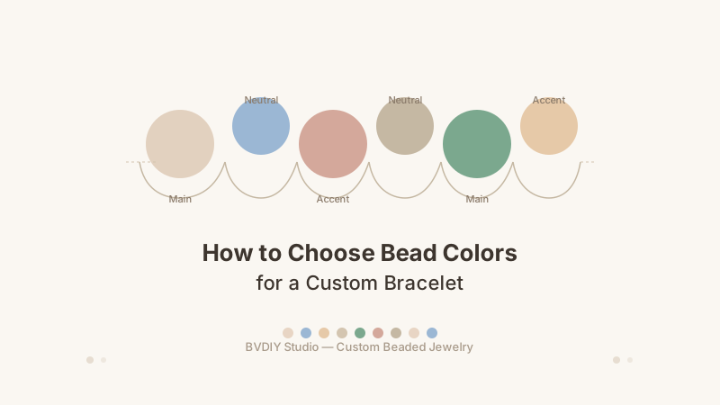
Color is the first thing people notice about a bracelet. Before they see the pattern, the bead size, or the clasp, they register the palette. That makes choosing your bead colors the most important design decision you will make. You do not need a design degree to pick colors that work — a few simple principles are enough to guide you toward a bracelet that looks intentional and beautiful.
Use the three-color method: one anchor color (the main mood), one neutral (cream pearl, white pearl, or clear crystal as filler), and one accent color (a small pop of contrast). Keep the ratio roughly 60 percent neutral, 25 percent anchor, 15 percent accent. Warm bead tones pair with gold spacers. Cool bead tones pair with silver spacers. When in doubt, lead with the color the recipient already wears most.
1. The three-color palette method
The most reliable approach to bead color selection uses three clear roles. The anchor color sets the overall mood — deep sapphire, warm emerald, soft rose, or any color that reflects the wearer's personality. The anchor typically fills about 25 percent of the bracelet's bead positions.
The neutral color fills most of the bracelet and keeps it wearable. Cream pearl, white pearl, and clear crystal are the most versatile choices because they go with everything. The neutral makes up roughly 60 percent of the design and ensures the bracelet matches any outfit.
The accent color adds a small pop of contrast, making up the remaining 15 percent. It can be a brighter version of the anchor, a complementary color from the opposite side of the wheel, or a metallic spacer finish. The accent should feel like a deliberate detail, not a competing main color. This 60-25-15 ratio creates a bracelet that reads as balanced and designed, not random.
2. Warm versus cool bead tones
Every bead color sits on a warm-cool spectrum. Warm tones include reds, oranges, yellows, creams, and earthy browns. Cool tones include blues, purples, greens, pinks, and silvery whites. Understanding this helps you choose beads that naturally complement each other.
Warm-toned bracelets feel cozy and classic. A palette of cream pearl, amber crystal, and gold spacers works year-round and pairs beautifully with gold jewelry. Cool-toned bracelets feel fresh and modern. A palette of white pearl, cobalt blue crystal, and silver spacers stands out against neutral clothing and pairs naturally with silver accessories.
You can mix warm and cool tones, but space them intentionally. Group warm beads together and cool beads together rather than alternating bead by bead. This creates distinct sections rather than a jumbled look. Browse the bead finishes available in the BVDIY bead library to see which tones resonate with your design.
3. Use the color wheel as your guide
Colors next to each other on the color wheel — analogous colors — naturally harmonize. Blue with blue-green, pink with peach, purple with lavender. These pairings create a smooth, coordinated look. Colors opposite each other — complementary colors — create contrast and energy. Blue with orange, purple with yellow, red with green. In a bracelet, complementary colors work best when one is dominant and the other is used sparingly as an accent.
For a safe and beautiful bracelet that works for almost anyone, pair any color with a neutral bead. Cream pearl with a blue accent. White pearl with a pink accent. Clear crystal with an emerald accent. The neutral bridges the gap between colors and ensures the bracelet remains wearable even with bold accent choices.
4. Let the wearer's style lead
The most successful custom bracelets fit seamlessly into the wearer's existing wardrobe. Look at their go-to jewelry metal — gold or silver tells you which spacers to use. Their most-worn clothing colors tell you which bead colors will complement their daily outfits. If you are designing for yourself, start with colors you already wear. A bracelet in your favorite palette gets more wrist time than a trendy one that does not match your closet.
If the bracelet is a gift and you are unsure about preferences, ask someone close to them. Most people have a known favorite color, a preferred metal, or a go-to style. Even knowing their favorite neutral — black, white, cream, navy — can guide your bead choices significantly.
5. Simple palette ideas to start from
Classic pearl: Cream pearl main beads, small gold spacers every third position, and a single accent color in four to five bead positions. Works for almost every recipient and every occasion.
Modern crystal: Clear crystal main beads, silver spacers, and one bold accent like sapphire or amethyst every fourth position. The transparency lets accent colors shine while keeping the overall look clean.
Warm earth: Champagne pearl beads, amber or citrine-toned accents, and gold spacers. Leans warm and cozy, especially popular for fall and winter gifts.
Each follows the three-color method and gives you a foundation to customize. Experiment with your palette in the BVDIY bracelet designer before finalizing.