
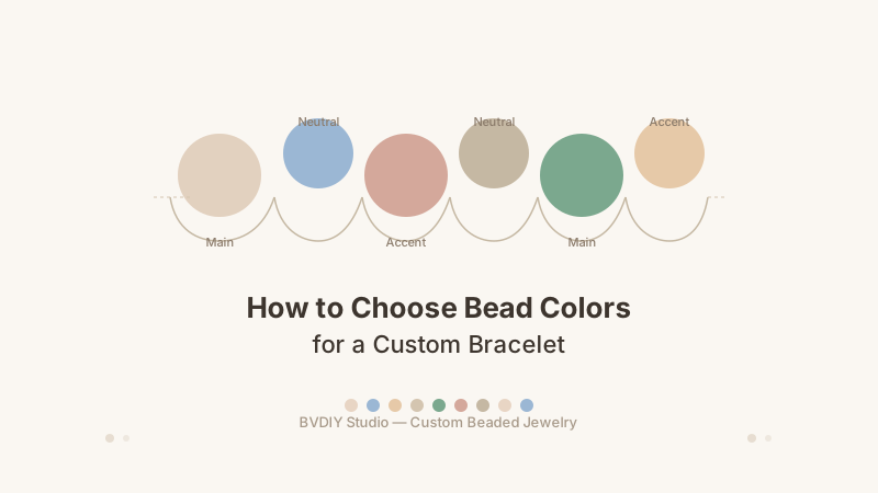
The most common question when designing a custom bracelet is where to start with colors. A handful of simple color principles can take a bracelet from feeling random to looking intentional — whether you are designing for yourself or choosing bead colors for a personalized gift.
Choose one main color, one neutral bead color, and one accent color. Use the neutral beads as spacers between stronger tones. Think about the mood you want the bracelet to carry — calm neutrals, bright accents, or warm metallics. Test your combination by looking at the full bracelet layout rather than judging one bead at a time.
1. Start with one main color
A bracelet with a clear anchor color always looks more put together. Your main color is the one that appears most often — it sets the overall feel of the piece. You might choose a deep navy for a calm, professional look. A soft rose for something romantic. A forest green for an earthy, grounded feel. A bright turquoise for a cheerful summery bracelet.
Think about what the bracelet is for. A daily wear piece often works best with tones that are not too loud. A gift bracelet can take inspiration from the recipient's favorite color. A memorial or sentimental piece often uses one meaningful color surrounded by neutrals.
Once you pick your main color, everything else supports it.
2. Add a neutral color as a spacer
Neutral bead colors are what keep a custom bracelet from feeling chaotic. They give the eye a place to rest between stronger colors. The most versatile neutral bead options are white pearl, cream, clear crystal, silver, and gold. Beige, champagne, and light grey work well too.
In practice, neutral beads act as breathing room. If you use three turquoise beads, one cream pearl, three turquoise beads, one cream pearl, the bracelet reads as cohesive even before you add an accent. Neutrals also make the bracelet easier to wear with different outfits — a strong color bracelet with neutral breaks feels more like everyday jewelry and less like a costume piece.
3. Choose one accent color that contrasts or complements
The accent color adds visual interest. A good accent color either contrasts with your main color or sits next to it on the color wheel. Here are some reliable pairings:
- Navy + rose gold: calm with a warm pop — professional but not cold.
- Forest green + gold: rich and earthy — works for both casual and dressy wear.
- Turquoise + silver: fresh and clean — great for summer or coastal feels.
- Deep purple + pale pink: romantic and creative — pairs well with crystal beads.
- Black + gold: classic and bold — strong statement with minimal effort.
Use the accent sparingly. One accent bead every four to six beads is usually enough to make the bracelet interesting without making it busy.
4. Think about mood before trends
Color trends come and go, but mood lasts. A bracelet designed around a feeling will always look more intentional than one designed around what is popular this season. Consider these simple mood palettes:
- Calm: cream pearls, pale blue crystals, soft silver accents.
- Warm: champagne beads, rose quartz tones, warm gold spacers.
- Bold: black stone beads, deep red crystals, bright silver connections.
- Natural: green stone beads, wooden or matte brown accents, cream pearls.
- Bright: turquoise, yellow crystal, white pearl, silver accents.
If you are not sure about the mood, start with the recipient's personality. Do they dress neutral and minimal? Go with one main tone and subtle accents. Do they love color? Give them a playful palette with two or three distinctive tones. The bracelet will feel like them.
5. Use the 70-20-10 rule
A classic design principle works well for bead colors: use about 70% main color beads, 20% neutral spacer beads, and 10% accent beads. This is not a strict formula, but it gives you a structure to start from.
For a 7-inch bracelet with roughly 35 beads at 8mm each, that looks like about 24 main-color beads, 7 neutral beads, and 4 accent beads. Adjust based on your bead sizes and layout preference. The principle still applies: one color leads, one color supports, one color highlights.
6. Consider metal spacer colors early
Gold and silver spacer beads count as colors too. They sit between your main beads and affect how the bracelet reads. Gold spacers warm up any palette — they pair especially well with earth tones, reds, creams, and deep blues. Silver spacers feel cooler and cleaner — they work naturally with pastels, blues, purples, and clear crystals.
Rose gold is a middle ground that works with pink, cream, and purple tones. Mixed metals can work, but keeping spacer colors consistent across the bracelet usually looks more polished. You can explore metal bead options in the BVDIY bead library.
7. Check the design in the full layout
One bead alone can look completely different in the middle of a bracelet. A bright yellow accent bead might look fun on its own but jarring when repeated five times around the wrist. A dark bead might disappear next to other dark beads.
This is why designing bead-by-bead with a tool matters. When you use the BVDIY bracelet designer, you see the whole layout before ordering. You can zoom out and ask: does the bracelet feel balanced? Does the color story make sense? Is there enough neutral space? If something feels off, adjust one variable at a time.
8. Test your color story with these quick combos
If you want a safe starting point, try one of these reliable three-color combinations:
- Pearl white + clear crystal + gold: elegant, safe, fits any occasion.
- Rose pink + cream + silver: soft, romantic, gift-friendly.
- Navy blue + silver + clear crystal: sharp, professional, modern.
- Olive green + cream + gold: natural, warm, understated.
- Black + white + gold: timeless, bold, works for any style.
You can always add more colors once you feel confident. The goal is not maximum color — it is a bracelet that looks like someone thought about it.
The same color principle holds true whether you are designing a simple everyday bracelet or a thoughtful personalized gift: choose a main color, support it with neutrals, and add accents with restraint. If the color story makes sense to you, it will make sense on the wrist.