
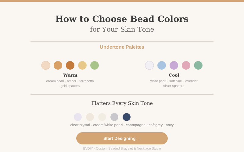
Una pulsera personalizada se apoya directamente sobre la piel, por eso el color de las cuentas es una de las decisiones de diseño más personales. Algunas paletas favorecen de forma natural a ciertos tonos de piel. Esta guía te enseña a identificar tu subtono, elegir colores de cuentas que te favorezcan y no ir a ciegas cuando diseñas una pulsera para otra persona.
Primero identifica tu subtono: cálido, frío o neutro. Las venas verdosas en la muñeca indican subtono cálido; las azuladas, frío; una mezcla, neutro. Los subtonos cálidos suelen lucir con perla crema, ámbar, terracota, melocotón cálido y verde oliva, combinados con separadores dorados. Los fríos suelen ir bien con perla blanca, azul suave, lavanda, rosa y esmeralda, con separadores plateados. Los neutros pueden llevar ambos. ¿Diseñas para otra persona? Quédate con los colores universales: cristal transparente, perla crema o blanca, champán, gris suave y azul marino favorecen a todos los tonos de piel.
1. Por qué importa el tono de piel, y por qué no es una regla estricta
Las joyas siempre se ven sobre la piel, así que ambas cosas son inseparables. Cuando el color de las cuentas acompaña a tu subtono, la pulsera parece integrada y no un elemento aparte. Una piel de subtono cálido junto a cuentas cálidas crea un brillo suave y armonioso; una piel de subtono frío junto a cuentas frías logra lo mismo de forma más nítida y luminosa.
Dicho esto, el subtono es una guía, no una ley. El contraste puede ser precioso: una persona de subtono frío con una pulsera de ámbar cálido está haciendo una declaración, no cometiendo un error. La regla más importante es que la pulsera te encante y la lleves de verdad. Usa estas paletas como punto de partida y luego confía en tu ojo.
2. Cómo descubrir tu subtono en menos de un minuto
Tres pruebas rápidas te dirán casi todo lo que necesitas. Hazlas con luz natural, porque la luz artificial distorsiona el color de la piel.
El test de las venas. Mira las venas de la cara interna de la muñeca. Las venas verdosas indican subtono cálido. Las azules o moradas indican subtono frío. Si cuesta distinguir el color, tu subtono probablemente es neutro.
El test de las joyas. Acerca una pieza dorada a una mano y una plateada a la otra. El metal que ilumina tu piel y le da un aspecto más saludable es el que coincide con tu subtono. Si los dos quedan igual de bien, eres neutro.
El test del papel blanco. Sostén un papel blanco liso junto a tu cara sin maquillaje. Si tu piel se ve ligeramente amarillenta o dorada a su lado, tiendes a cálido. Si se ve rosada, tiendes a frío.
Cuando conozcas tu subtono, explora los acabados de la biblioteca de cuentas de BVDIY y elige a partir de la paleta que verás a continuación.
3. Subtonos cálidos: paletas ricas, terrosas y doradas
Los subtonos cálidos tienen matices dorados o melocotón, así que los colores de cuentas que comparten esos matices armonizan mejor: perla crema, perla champán, ámbar, terracota, melocotón cálido, coral, verde oliva y amarillo dorado. Quedan naturales junto a una piel cálida y dan a la pulsera un aire suave y soleado.
Los separadores y el cierre dorados refuerzan la calidez. Un diseño cálido clásico usa una base de perla crema con acentos de ámbar cada cuatro posiciones, separados por pequeños separadores dorados. ¿Quieres un toque de contraste? Añade una o dos cuentas más frías —verde profundo o azul marino apagado— sin pasar del 10 al 15 % del diseño.
4. Subtonos fríos: paletas nítidas, claras y plateadas
Los subtonos fríos tienen matices rosados, rojizos o azulados y brillan junto a colores de la misma familia: perla blanca, champán frío, azul suave, lavanda, cuarzo rosa, esmeralda y tonos baya. Estos colores recogen los matices fríos de la piel y crean una armonía luminosa y fresca.
Los separadores y el cierre plateados completan el look. Un diseño frío clásico usa una base de perla blanca con acentos azul suave y separadores plateados entre ellos. La pulsera se ve nítida y limpia, y combina sin esfuerzo con relojes y anillos de plata. Un único acento cálido, usado con moderación, puede añadir interés.
5. Subtonos neutros: libertad para elegir
Si tus venas muestran una mezcla y tanto el dorado como la plata te quedan bien, tu subtono es neutro, la posición más fácil desde la que diseñar. Ambas paletas te favorecerán, así que elige según tu ropa, tu estado de ánimo o el efecto que quieras que tenga la pulsera.
La estrategia más útil es construir sobre una base neutra —perla crema, perla blanca o cristal transparente— y dejar que el color de acento aporte la personalidad. Ve hacia lo cálido con ámbar y dorado para un aire rico y acogedor, o hacia lo frío con azul suave y plata para un look fresco. Los subtonos neutros también llevan con más facilidad los diseños que mezclan metales.
6. Colores que favorecen a todos los tonos de piel
Algunos colores de cuentas funcionan para absolutamente todo el mundo porque se sitúan justo entre lo cálido y lo frío. El cristal transparente nunca desentona: simplemente atrapa la luz. La perla crema y la blanca tienen la calidez neutra más suave y combinan con cualquier metal. La perla champán une matices dorados y plateados en un acabado delicado. El gris suave resulta sofisticado con ambos metales, y el azul marino profundo favorece por igual a pieles cálidas y frías.
Un diseño universal fiable: 70 % de perla crema o cristal transparente, 25 % de uno de los neutros anteriores y 5 % de un pequeño acento que te guste especialmente. La base garantiza que la pulsera favorezca tu piel; el acento la hace tuya.
7. Diseñar un regalo sin conocer el subtono
Al diseñar un regalo no puedes probar los colores sobre la muñeca de esa persona, pero sigues teniendo pistas fiables. El camino más seguro es la paleta universal: perla crema o blanca con acentos de cristal transparente favorece a todos y se ve de calidad con cualquier acabado.
Para afinar más, fíjate en lo que ya lleva. Su ropa es la mejor señal: quienes prefieren terracota, verde oliva, mostaza y camel suelen tener subtono cálido; quienes prefieren azul, gris, tonos baya y negro suelen tenerlo frío. Sus joyas te dicen qué metal prefiere, y elegir ese mismo metal es la decisión más segura. Usa el diseñador de pulseras de BVDIY para previsualizar la paleta antes de cerrar el diseño.
8. El metal sigue la misma lógica
Los separadores y los cierres también están en contacto directo con la piel, así que el metal merece la misma atención. El dorado suele favorecer a los subtonos cálidos y la plata a los fríos. Aun así, no es una obligación: mucha gente lleva el metal que prefiere y le queda estupendamente.
El único consejo práctico es mantener un metal dominante en lugar de repartirlos a partes iguales. Una pulsera mayoritariamente dorada con un cierre plateado de acento parece una elección deliberada; una mezcla exacta al 50 % puede verse indecisa. Elige un metal para separadores y cierre, y usa el otro con moderación, o no lo uses.
9. El método de la paleta de tres colores
La forma más fiable de elegir los colores de las cuentas se basa en tres papeles claros. El color ancla marca el tono general: zafiro profundo, esmeralda cálido, rosa suave o cualquier color que refleje la personalidad de quien la lleva. El ancla suele ocupar alrededor del 25 % de las posiciones de la pulsera.
El color neutro llena la mayor parte de la pulsera y la hace fácil de llevar. La perla crema, la perla blanca y el cristal transparente son las opciones más versátiles porque combinan con todo. El neutro supone aproximadamente el 60 % del diseño y asegura que la pulsera vaya con cualquier conjunto.
El color de acento añade un pequeño toque de contraste y ocupa el 15 % restante. Puede ser una versión más viva del ancla, un color complementario del lado opuesto del círculo cromático o un separador metálico. El acento debe parecer un detalle deliberado, no un segundo color principal que compita. Esta proporción 60-25-15 da como resultado una pulsera equilibrada y diseñada, no aleatoria.
10. Usa el círculo cromático como guía
Los colores contiguos en el círculo cromático —colores análogos— armonizan de forma natural: azul con verde azulado, rosa con melocotón, morado con lavanda. Estas combinaciones crean un aspecto suave y coordinado. Los colores opuestos —complementarios— crean contraste y energía: azul con naranja, morado con amarillo, rojo con verde. En una pulsera, los complementarios funcionan mejor cuando uno domina y el otro se usa con moderación como acento.
Para una pulsera segura y bonita que funcione para casi cualquiera, combina cualquier color con una cuenta neutra. Perla crema con un acento azul. Perla blanca con un acento rosa. Cristal transparente con un acento esmeralda. El neutro hace de puente entre colores y mantiene la pulsera fácil de llevar incluso con acentos atrevidos.
Guías relacionadas (en inglés): separadores dorados o plateados para pulseras y cómo superponer y combinar pulseras de cuentas personalizadas.