
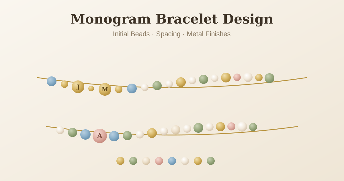
Some of the most-worn bracelets we see start with a single letter. An initial does something a full name cannot quite do: it stays private — obvious to the wearer, quietly meaningful to the few people who know why it is there. A monogram bracelet works the way a signature works: a small, deliberate statement of identity you carry on your wrist. This guide covers the format choices, the letter beads, and the spacing details that separate a monogram that looks like an afterthought from one that looks designed — whether it is for you, or for someone whose initials you already know by heart.
Choose the format first. A single initial reads as a quiet signature; two initials — your own, or a shared pair — are the most popular; three letters make a true monogram. Spell the letters with letter beads in one size and one finish, separate each initial with a small spacer bead, and keep the rest of the palette to two or three colors so the letters stay the focal point. 6mm letters feel delicate; 8mm read more boldly. Start in the BVDIY designer and browse the bead library for letter beads, spacers, and metal finishes before you commit.
Choose the format before you choose the beads
Every other decision follows from how many letters you want, so settle that first. Three formats work on a wrist.
A single initial. One letter bead — or a letter framed by two small spacers — is the quietest option and the most flexible. It works in any palette, suits any metal, and reads as a signature rather than a name tag. It is also the easiest to make feel expensive, because the design does not have to do anything except sit well.
Two initials. The most popular format, because it carries more meaning without losing balance: first and last name, the two initials of a couple, or a parent-and-child pair. Two letters with a spacer between them stay symmetrical and read clearly.
Three letters. This is a true monogram, and on a bracelet it reads best when all three letters share the same size. Traditional monogram etiquette — first, middle, then a large last initial — comes from stationery and linens; on a wrist, symmetry matters more, so keep the letters even unless you are deliberately making the center the statement.
Pick the letter beads that will carry the design
The letters are the design, so the beads need to be right. Our bead size guide compares all the options in detail; the short version is that 8mm letter beads are the most readable and give a monogram presence, while 6mm letters read as delicate and suit slim wrists and layered stacks. Pick one size and stick to it — mixed letter sizes break the line.
Finish matters just as much. All the letters should share one finish: all gold-toned, all silver-toned, or all in the same neutral. Mixed-metal letters read as an accident, not a choice. Round letter beads sit flush in the strand and keep the monogram part of the bracelet's overall line; flat stamped charms sit differently and belong in a charm design rather than a monogram.
If the letters are the only colored elements, they naturally become the focal point — exactly what you want.
Spacing is the detail that makes a monogram read
Spacing is where monogram bracelets get made or missed. Put a small spacer bead between initials — a 3–4mm round metal bead or a quiet neutral works — so the eye can separate the letters without the strand looking busy. Two or three letters with single spacers between them is the pattern that reads best.
Frame the monogram the same way you would frame a sentence: one small spacer at each end of the letter group separates the initials from the rest of the design. Beyond that, resist spreading the letters with decorative beads between them — once there are beads between the letters, it stops reading as a monogram and becomes a word bracelet with a different logic, covered in our name bead guide. And when you choose the spacers themselves, the gold vs silver spacer guide explains which metal reads warmer or cooler — the choice genuinely changes the mood of the piece.
Match the metal and palette to the wearer
A monogram is personal, so the palette should be too. Gold spacers and letter beads warm the piece and pair naturally with pearl, blush, and cream tones; silver reads cooler and suits crystal, hematite, and deep blues. If you are designing for someone whose jewelry you know, follow their metal — most people wear one consistently.
Keep the field around the letters quiet. Two or three colors total, with the monogram as the center, follows the same rule as every balanced design in our bead color guide. The letters need contrast: on a pale strand they should be darker or metallic; on a dark strand, pale or gold. Skin tone matters more than people expect — our skin tone color guide explains the honest short version.
When initials beat a full name
Initials are the right choice more often than people think. Long names that would fill an entire bracelet, understated gifts for colleagues or teachers, and pieces for men who would never wear a name spelled out — all of these read better with one, two, or three letters than with a full name. Initials are also the natural choice for matching sets: a couple's two initials, mother and daughter wearing matching initial bracelets, or a shared family letter worn in different palettes.
Our name bead guide covers when a full name is the better call — short names, children's bracelets, and message designs where the word itself is the point. When the goal is a mark rather than a message, initials win.
Monogram ideas worth stealing
A few designs that show up again and again in our orders, and work every time.
Couple's initials. His initial, a shared letter or small heart charm, her initial — or simply the two initials with a spacer between. Worn alone or as a matching pair.
Parent and child. The parent's initial and the child's initial side by side, with the child's birthstone as the accent — the same logic as our baby keepsake designs, scaled down to two letters.
Single initial plus birthstone. One letter framed by a birthstone on each side; the birth month becomes the second layer of meaning. Our birthstone guide lists every month's stone.
Shared family letter. One initial worn by several people in different palettes — a set that unites without matching exactly.
For gift-giving, the monogram is also the most forgiving format: you do not need to know a favorite color to get the letter right. Our gift guide for any occasion has more on wrapping the meaning around the design.
Ready to put an initial on a wrist? Choose your format, pick the letters, and build it bead by bead in the BVDIY designer — browse the bead library for letter beads, spacers, and metal finishes that let the monogram speak before you commit.